Sunrise Connections
A Streamlined Mobile Social App Encouraging Seniors To Feel Comfortable Engaging With Others
Loneliness compounds health problems both mentally and physically, coming in the form of depression, anxiety, dementia, and heart disease.
-National Institute on Aging
-CDC on Alzheimer’s Disease and Healthy Aging
“Nearly 25% of adults aged 65 and older are considered to be socially isolated”…
A Brief Introduction to Sunrise Connections
Sunrise Connections is a social app for elders that aims to address the problem of elder loneliness. To do so, the primary purpose of the app is to encourage elders to socialize with others. Based on our team’s own user research, testing, and design iterations, we recognized that loneliness, in the case of our elderly participants, stems from self hesitation and excessive consideration of others. This has led to the isolation of elders who do have a desire for interaction, and what Sunrise Connections hopes to do is tackle the problem from a baseline level.
Get Comfortable Socializing With Others In The Daily Routine
Chat away in the Discussion Forum With Other Seniors
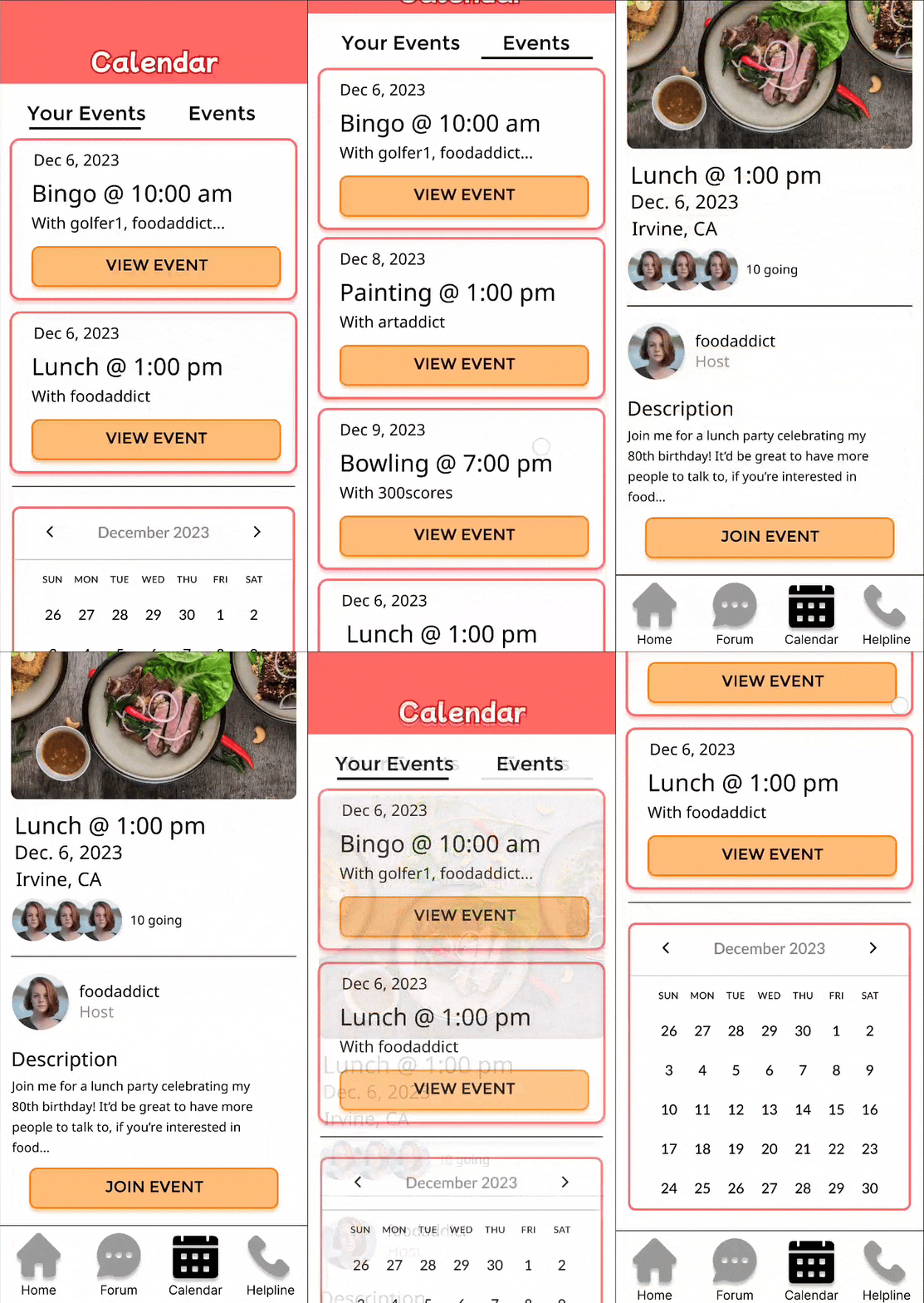
View Events Hosted By Others and Keep Track Of Them In Your Calendar
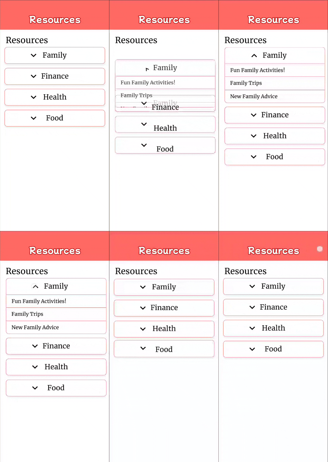
Easily Access Online Resources With A Few Clicks
An Overview Of The Project
Overview
As I entered my final year of university, I took the two-quarter long INF 191A-B course series, otherwise known as the Senior Design Capstone Project. In this class, students are asked to select from a variety of projects that sponsors present to us to showcase their understanding of their respective major. For this project, I worked in a team of 6 with our sponsor, Tata Consultancy Services, to design a product from scratch.
Tata Consultancy Services, otherwise known as TCS, is an IT services, consulting, and business solutions organization that focuses on bringing innovation to businesses that need technological solutions. For our Senior Design Capstone Project, TCS partnered with the University of California, Irvine, looking to work with a team of students (my team) to develop a software project from start to finish.
For our collaboration with Tata Consultancy Services, we have been tasked with addressing the challenge of elder loneliness.
The Problem
How might we reduce elder loneliness in adults aged 60 plus, so that we may promote a healthier social life?
Recognizing the Baseline For the Project
Sponsor Requirements
It was important for our team to recognize: what has the sponsor given us to work with so far, and what are they looking for? At the start of this project, we were debriefed on what the sponsors are expecting from us, and what we should aim for. The main task given was: From start to finish, design and develop an application that addresses elder loneliness. With that in mind, we were given these requirements as a starting point, subject to change.
A social networking platform, Calendar Of Events & Activities, Library of Resources, Discussion Forum, Emotional Wellbeing, Games & Activity
These requirements were not set in stone, but rather a starting point for the team. As for the project itself, TCS asked us to primarily take charge in the design and development of the app, with occasional meetings to update and track progress.
Project Planning
To ensure the progression of our project went smoothly,
We got together as a team and created a project timeline. Following the general guidance of our class’s professor, we would have two major phases of the project: Research & Design for one academic quarter (10 weeks), and then Testing & Development for the remaining academic quarter. For each quarter, we made sure to create a living document of the work we would plan to do in a “Project Plan” document, as well as a Team Gantt Chart to gauge the availability of the team.
Project planning was an important aspect of our work because while this project was considered a part of a class, us students as a team were largely responsible for ensuring progress was made in a manner that would guarantee a satisfactory final product. It included documents that would list out Requirements, User Interface, Risk Analysis, and Architectural Design. Many of these documents were constantly updated as we met with our sponsors and professor, as is with the nature of a software project.
Check out Project Plan 1 & Project Plan 2
Before starting any research or design work,
Our Target Audience
My team, TCS, and our teaching staff made clear the importance of elder loneliness, and how we address the topic. In particular, it was important for the team to reach out to and talk to possible end-users to understand what causes elder loneliness, from the perspective of the elder themselves. A major assumption we made was that elders may not have the highest technical expertise, so the earlier we started talking to actual elders, the better our understanding of the design space would be.
As a product targeted towards elders aged 60 plus,
Involving Real Users In The Process
Reaching Out To Users
In an attempt to gather a diverse set of participants,
Our team initially decided to try and gather possible end-users via two primary means: elderly centers & online forums. By tackling both in-person and online methods, we hoped to gather participants that had a variety of background quirks, whether that be technical expertise, life experiences, and most importantly, a broader understanding of what “elder loneliness” means to them.
User Surveys
With that in mind, we were able to gather participants for user surveys, user interviews, and usability testing, albeit in varied numbers.
To justify the need to address elder loneliness,
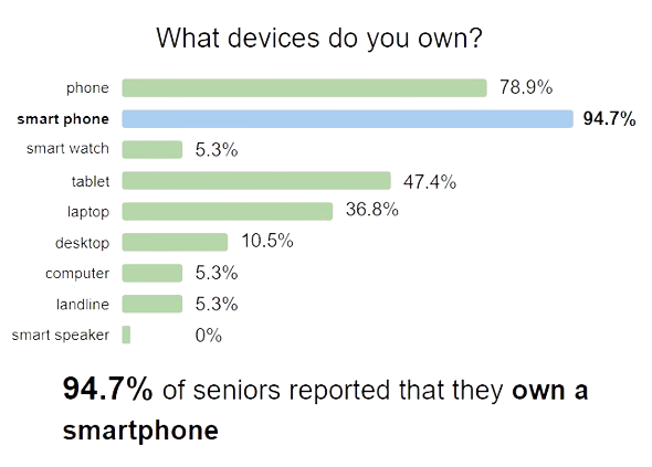
We created a user survey that we sent out to elders that were interested, garnering 22 total responses. The survey asked questions primarily surrounding technological use & how they currently socialize. Questions such as “What kind of devices do you own?”, “Are there any difficulties contacting people”, and “Have you thought about meeting other people to talk to?” helped us validate that there is in fact a need to design our product, and in what form. Our primary findings were:
Our findings allowed us to conclude that our product would be a mobile application, and the problem we’re tackling should be addressed.
Grouping of Themes & Actionable Insights
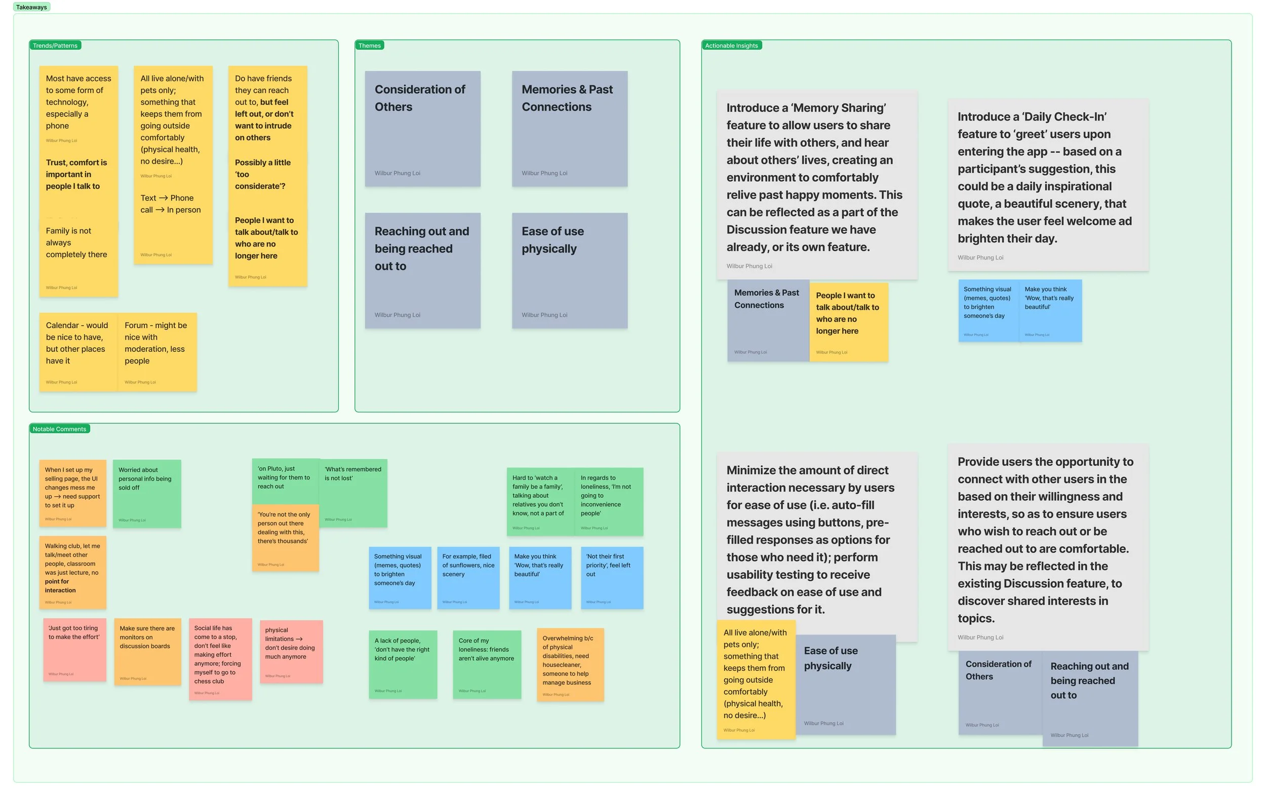
Through the creation of an affinity diagram, I was able to identify, what we believed to be, focal points of “loneliness” and its effects from the perspective of our participants.
Only by recognizing how loneliness directly affects these elders’ lives and how they feel can we design a desirable solution.
In particular, these 2 quotes from one of our participants strongly summarized how loneliness had affected our participants in general:
In regards to the elders I interviewed, loneliness has become a significant obstacle in their social life, where they are “too considerate” of others, negatively impacting their own wellbeing.
Loneliness had become something that perpetuates an endless cycle of hesitation for elders, despite their rather keen desire to actually talk to others and just have someone to be there for them. With this key discovery in mind, we needed to next determine what features we wanted to focus on, and what exactly is the main concept of our product.
Originally, the plan was to recruit adults 70+ as elders…
However, our team quickly ran into trouble as we struggled to find elders that matched our demographic requirement. Attempts for in-person recruitment fell through as the nearby elderly centers that we contacted were hesitant to allow us to engage with their community members. For online recruitment, we realized that looking for elders online was extremely limited in options, especially depending on the age requirement we initially set for our project. The recruitment process for participants in our project went on for about 2 weeks, and as our time was limited, we came to a decision:
We reduced our age range to 60+ for elders, and decided to focus on online recruitment, as in-person centers were proving to be unfruitful.
We made the decision to limit our scope to online participants, which definitely had a few consequences for our designs moving forward. This would lead to much higher worries of:
Anonymity and reliability of users actually being elders
Limited online spaces to look for elders to participate
Difficulty gaining trust of possible participants
The biggest issue we had with online recruitment was definitely “trust”. To recruit, we posted a flyer requesting volunteers for our project, and we found many responses that indicated suspicion of our intentions. There were worries of being scammed and clicking on viruses, for example.
User Interviews
In response to the question, “Have you thought about meeting other people to talk to/be in the company of?”, 84.6% of participants answered “Yes”.
To understand what “loneliness” is to elders,
I conducted user interviews with participants from our survey that were interested. Of the 22 responses, we were able to get in contact with and interview 5 participants. The interview consisted of questions regarding experiences with social life & gauging potential features for our product. We wanted to understand how loneliness applied to each individual person, and how our product might be able to help alleviate the issue.
To consolidate the data, I personally analyzed the user responses and created an affinity diagram that helped us identify key themes, notable comments, and actionable insights. View the full affinity diagram FigJam here.
An Encouraging Social App
Based on the research we conducted so far,
We wanted to create a mobile application that focuses on socializing, specifically catered towards elders. From the experiences of our participants, we learned that many hesitate to be the first to reach out, even more-so if via technological means. With that in mind,
Our plan was to design and develop a social application, similar to Facebook & Reddit, catered towards encouraging elders to be comfortable in engaging others.
Validating Our Product Concept
Current Caterings Towards Elders
With a social app in mind, our team first felt that we had to confirm that our mobile app concept was a valid solution; what social apps currently exist for elders?
To do this, we first had to specifically research existing solutions and/or adjacent solutions as a starting point. We observed AARP, SeniorForums, and SilverSurfers. From there, we identified key opportunities for our app, Sunrise Connections, to present itself:
Community & Engagement As A Secondary Factor
Identifying Key Features
SilverSurfers
Following our initial sponsor requirements and personal user research, we needed to update and prioritize key features of Sunrise Connections.
A social networking platform, Calendar Of Events & Activities, Library of Resources, Discussion Forum, Emotional Wellbeing, Games & Activity
Looking at our initial features given by the sponsor, there are already the makings of a social application as we had decided on. Knowing that, we decided to prioritize all of the features given, except for Games & Activity. As a social app encouraging elders to engage with each other, we wanted to first focus on the capability to talk to fellow users before thinking about different ways of interaction such as Games. However, as we looked over the features and our app concept, a question arose:
How might we implement features that successfully encourages elders to feel comfortable interacting with other elders so that they may socialize?
According to our research, a key concern was that elders we interviewed were hesitant to reach out to people they want to talk to, despite a desire to interact. Hence, helping elders feel comfortable engaging with others is vital to the purpose of the app. In an attempt to address this question, we proposed a new major feature: Daily Routine.
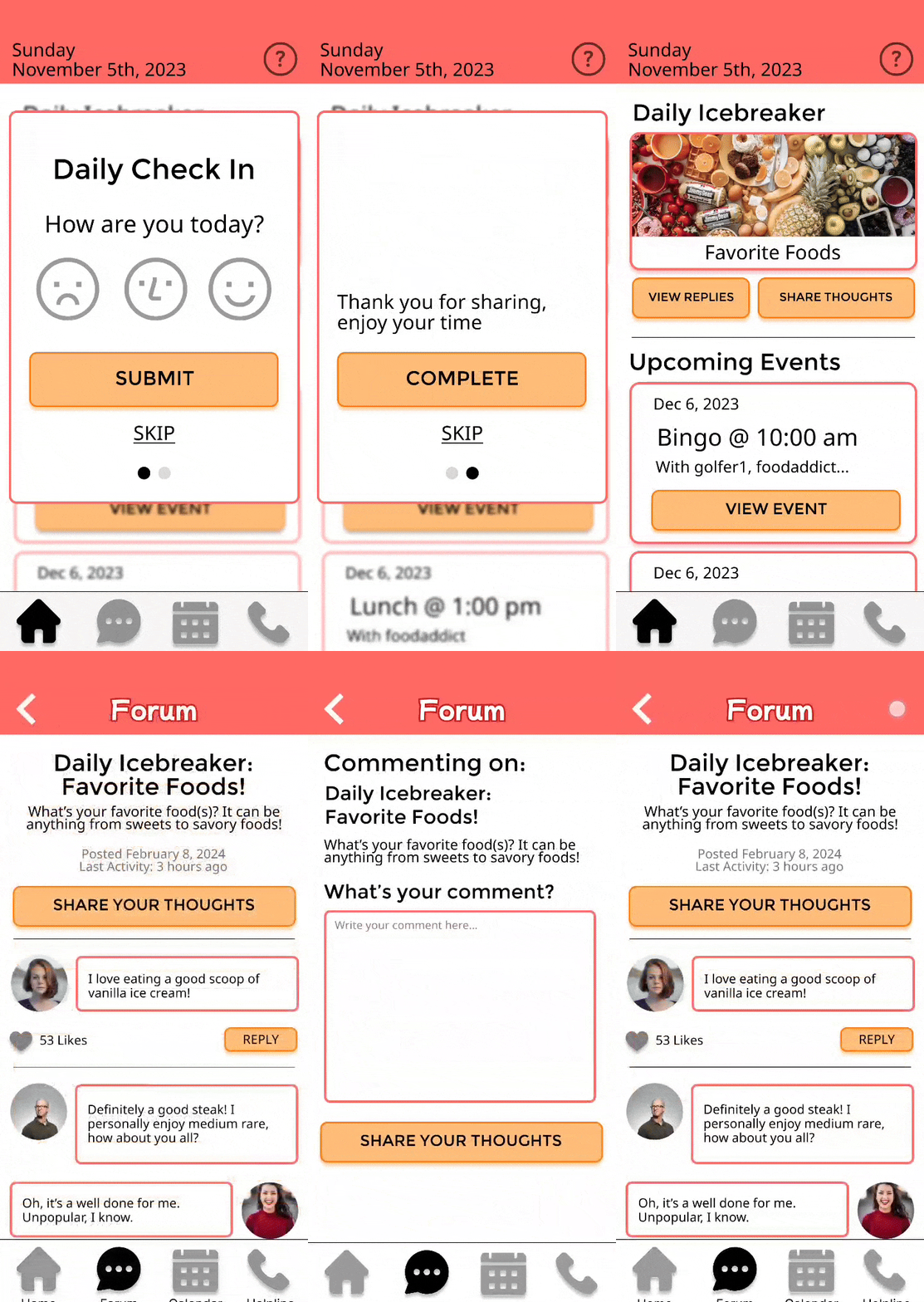
The idea of a Daily Routine is that upon opening Sunrise Connections for the day, elders will be prompted with some form of a “routine check-in” that helps ease them into the app.
Our research has indicated that the starting point for us is that elders are hesitant to socialize due to a fear of being in the way of others; with this in mind, the Daily Routine will help diminish that fear and encourage elders to interact in Sunrise Connections to the fullest.
AARP presents itself primarily as a source of information for elders to access, where community is not an upfront feature.
While AARP does have a main website (pictured below), the community aspect of the app is not an apparent focus. Instead, the top menu provides access to different categories of information, and the website itself provides news articles. In order to access the community of AARP, I had to separately perform a Google search to find a different link directly to their discussion forums.
AARP Main Landing Page
The Limitations of Web-only Platforms
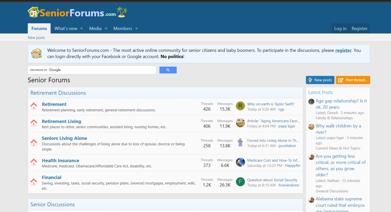
Platforms with a focus on community such as SilverSurfers and SeniorForums are web-only, proving difficult for modern day mobile users.
SeniorForums
The other platforms we observed, SilverSurfers and SeniorForums, are more direct competitors to our idea, with a greater focus on community via Discussion Forums. This lined up with one of the feature requirements our sponsor initially provided, but we recognized was that there was a clash with the research we personally conducted. Our research showed us that of the participants we surveyed, 94.7% of the elders owned a smartphone when questioned about what kinds of technology they had. With this in mind, we felt that this further validated our idea to create a social app that is mobile-focused for elders.
Based on our research on our audience and existing solutions, we validated our app concept to streamline a way of socializing for elders.
Designing an Initial Product
Lo-Fidelity Wireframing
To better visualize the features of our app, the team each designed different versions of how the app may look and function.
For the initial wireframes, we designed the features that TCS had initially given us. Before adding on any new features, we wanted to visualize how our social app may look in its simplest form.
Looking across the designs as a whole, we found that many of our designs shared similarities, matching modern day social media apps that have things like Discussion Forums, Event Pages, and Resources. With that in mind, we came across our major design decision, the navigation of the app.
To view our initial wireframes, click here.
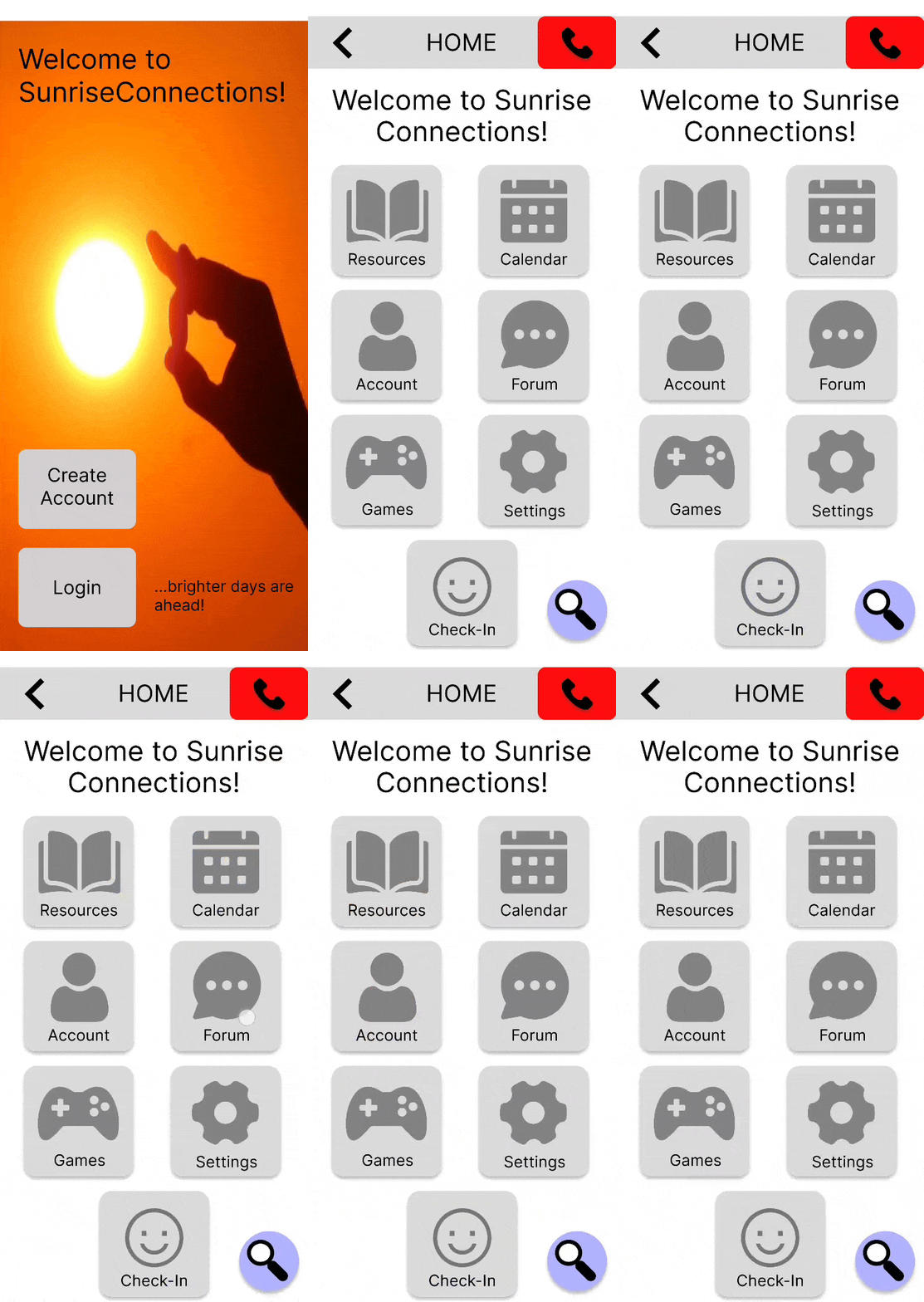
Homepage Main Navigation Prototype
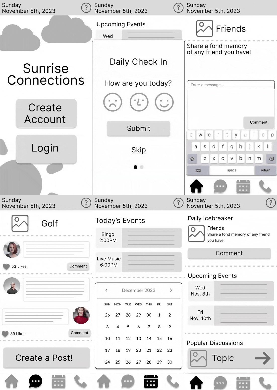
Home Page Navigation
Daily Check In
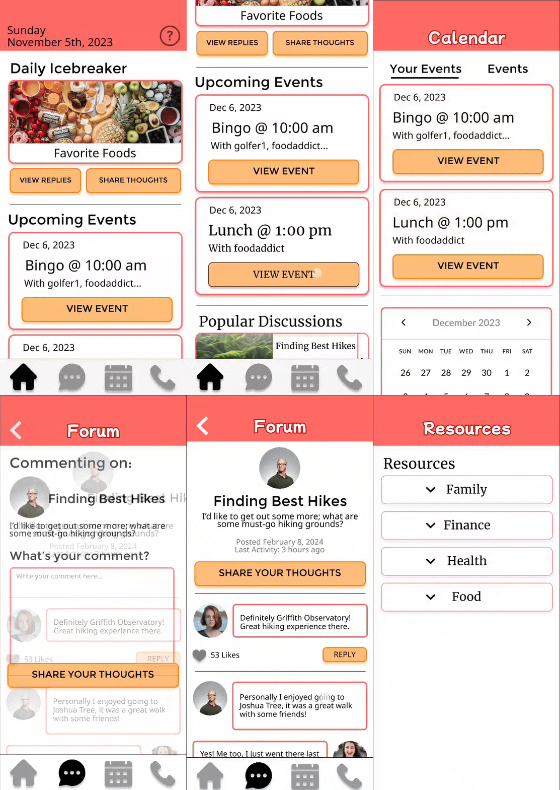
After going through the Daily Check In, elders will land on the Homepage of Sunrise Connections. There, they would find the Daily Icebreaker. The Daily Icebreaker is a daily random question prompted to users across the app, where all elders can see the same question and answer or view others’ responses. These questions would be very simple questions that everyone can talk about. The purpose of the Daily Icebreaker is to, similar to the Daily Check In, encourage elders to share their thoughts. This time, all elders are given a simple question to spark light-hearted conversation, further easing elders into deeper social interactions in the Events or Discussion Forum features.
Home Page Navigation vs. Navigation Bar
When sharing initial wireframes, the form of navigation became a challenge that we had to take into testing.
The two primary ways of navigation that our team had designed were first, a typical bottom navigation bar with the features of the app being easily accessible. The other navigation was a navigation that used the Homepage as the main touchpoint to access the various features. While the bottom navigation bar would have made sense given that many mobile applications make use of this navigation method these days, one of our teammates brought up a hypothesis that made us reconsider:
Elders, due to a higher likeliness of physical challenges and unfamiliarity with technology, may be more comfortable with a simple Homepage that has big buttons to access features.
Initially, with the bottom navigation bar in mind, the Homepage would consist of brief summaries of different features, showing things such as “Trending Discussions” and “Upcoming Events”. However, the concern came up that making the homepage too complicated may confuse elders in the purpose of the app, as that’s the first page they would see upon opening the app. As a team, we decided to, for now, continue designing both forms of navigation as we move into mid-fidelity wireframes, and to test both designs in usability testing. Testing of navigation will be found in below sections.
Bottom Navigation Bar
Visualizing the Daily Routine
As a feature meant to encourage elders to gradually socialize, the Daily Routine needed to be designed in a way that makes them feel welcome.
As we moved into mid-fidelity wireframing, we further fleshed out the concept of the Daily Routine. The Daily Routine will have two parts: the Daily Check In and Daily Icebreaker.
Upon opening Sunrise Connections for the day, elders will be prompted with a popup that welcomes them to the app, asking them how they feel. Elders can select their mood at the moment, and upon sharing, they are shown a Thank You image that varies from scenes of nature or cute animals. The purpose of the Daily Check In is to be a quick-and-easy way to encourage elders to share how they feel, prepping them to use the app.
Daily Icebreaker
Interactive Mid-Fidelity Prototyping
To prepare for usability testing, I moved forward with designing mid-fidelity Figma prototypes to test with our target audience.
As mentioned, we would perform usability testing with two different versions of navigation, and through this, we hoped to confirm a preferred form of navigation as well as feedback on the features we designed.
Bottom Navigation Bar Prototype
With an interactive prototype ready for testing, this marked the end of the 1st academic quarter, and with the start of testing, we moved into the second phase of our project, Testing & Development.
A Request For Personalization from our Sponsor
Before moving into testing, our sponsor provided feedback to our design plans and strongly suggested implementing personalization into the app.
Throughout the research and design phase of our project, we met with our sponsor, TCS, typically every 2 weeks to update them on our progress. Before moving forward with prototyping our designs, we made sure to share our key features, including the Daily Routine addition, as well as our reasoning for the app’s purpose. After discussion with our sponsor, the general consensus was that a social app encouraging elders to socialize is a good concept, especially backed by research. However, a primary suggestion from TCS was to personalize. Similar to modern day social media apps, TCS requested us to design and develop our app in a way where it is able to read user data and show them content that they would like. This, however, was an immediate problem for our team as the team did not have experience in the development they were asking for.
It was important to make it clear to our sponsors that our team may not be capable of producing personalization to the extent of what they requested; instead, we brainstormed a simpler form of personalization for Sunrise Connections: Onboarding.
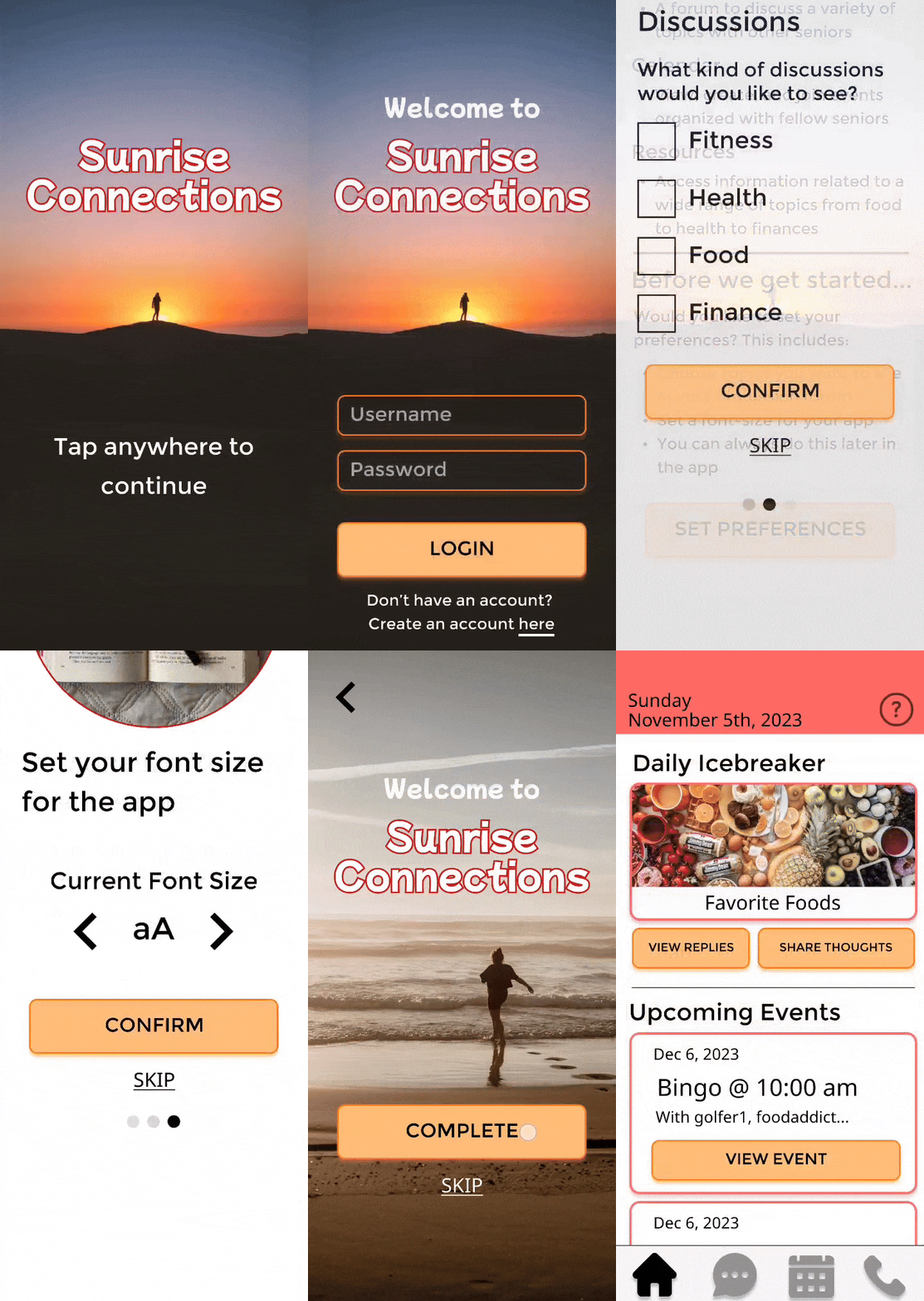
In order to develop the kind of feature TCS wanted, we would likely need ample experience in data collection and data analysis development; however, that just was not something we had. To introduce personalization into Sunrise Connections, we instead designed a much simpler feature that many apps make use of: Onboarding. In this simple Onboarding session, users would be welcomed to the app, and be asked to “personalize” their experience, primarily by selecting topics they’d be interested in seeing in the Discussion Forum, as well as their preferred font size. By introducing a simple form of personalization where possible for our users, we attempted to satisfy our sponsor’s request in the best way we could.
Usability Testing
Our Testing Goals
The purpose of usability testing for Sunrise Connections was to gauge primarily the usability of our key features as well as A/B testing our different forms of navigation.
For usability testing, we asked our past interview participants whether they were interested in testing our prototype, and were able to get 3 total participants. We did one primary usability testing session with our participants, asking them to navigate through our prototype as they complete tasks and giving feedback along the way. In this session, we asked questions such as:
Can you show me how you would create an account?
How might you reply to the first comment in this discussion?
By getting feedback on the actual usability of our prototype, we would be able to implement the feedback and accordingly shared our updated prototype in a second, informal usability testing session. To view how the usability testing script was set up, view the document here.
Visual Clarity
Bringing Our Prototype To Hi-Fidelity
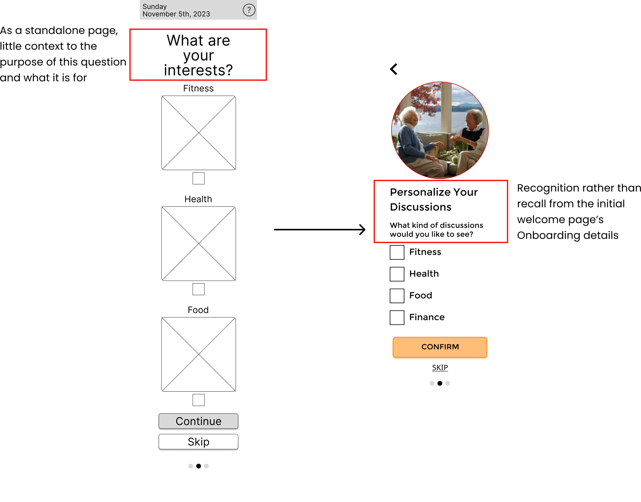
Onboarding Personalization Page Changes
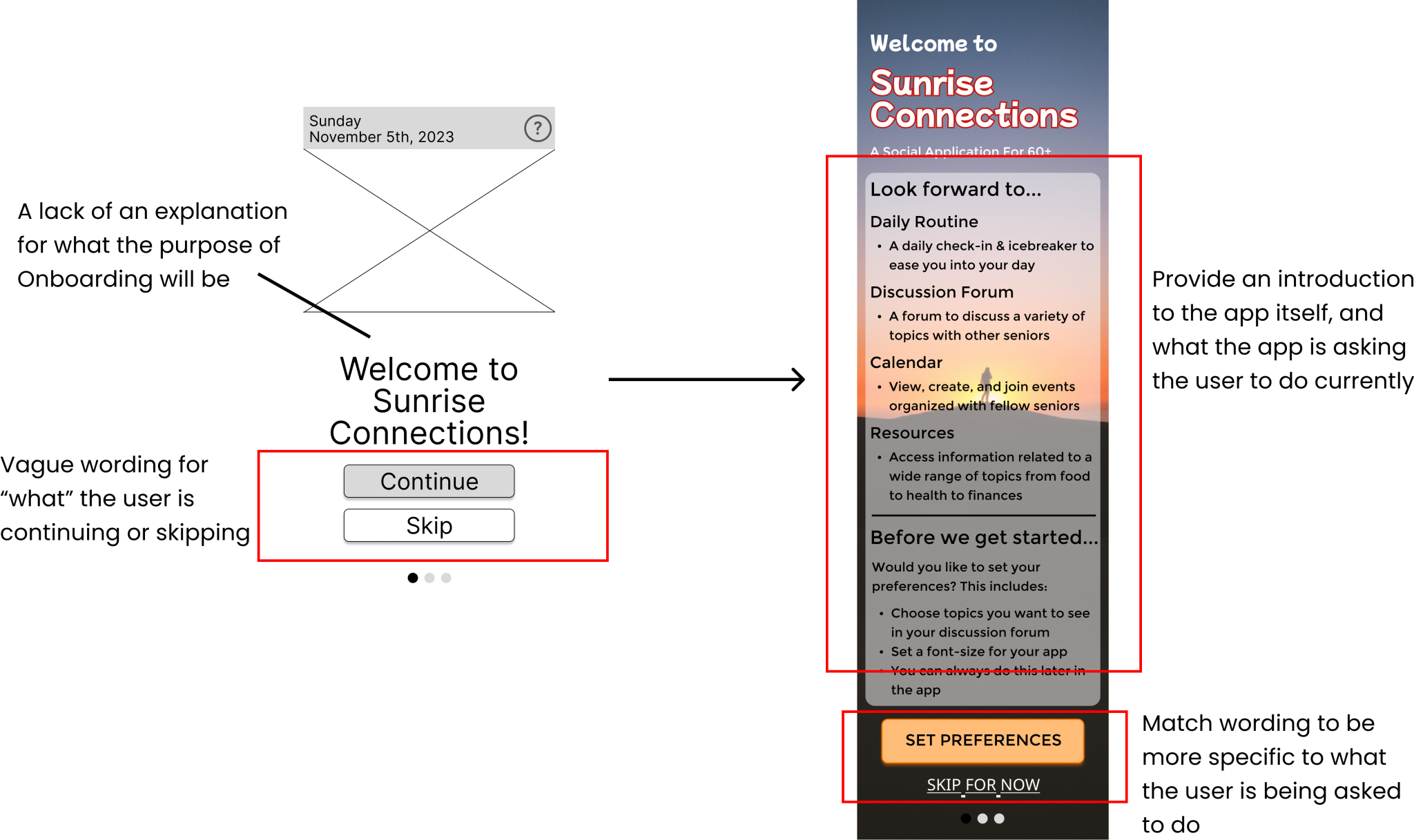
Bringing context into the Onboarding and what it asks users to do was a vital design change; I designed our Onboarding to be more upfront about what the app is, what the Onboarding will ask users to do, as well as making sure each page clarifies its purpose.
After the first usability testing session, I updated our designs into a hi-fidelity interactive prototype.
By bringing our designs to hi-fidelity, we hoped to better visualize the final design iteration for this app before moving into development. And, if time permitted, we would perform an informal “update” with our participants to garner feedback on the hi-fidelity prototype. gifs for each feature?
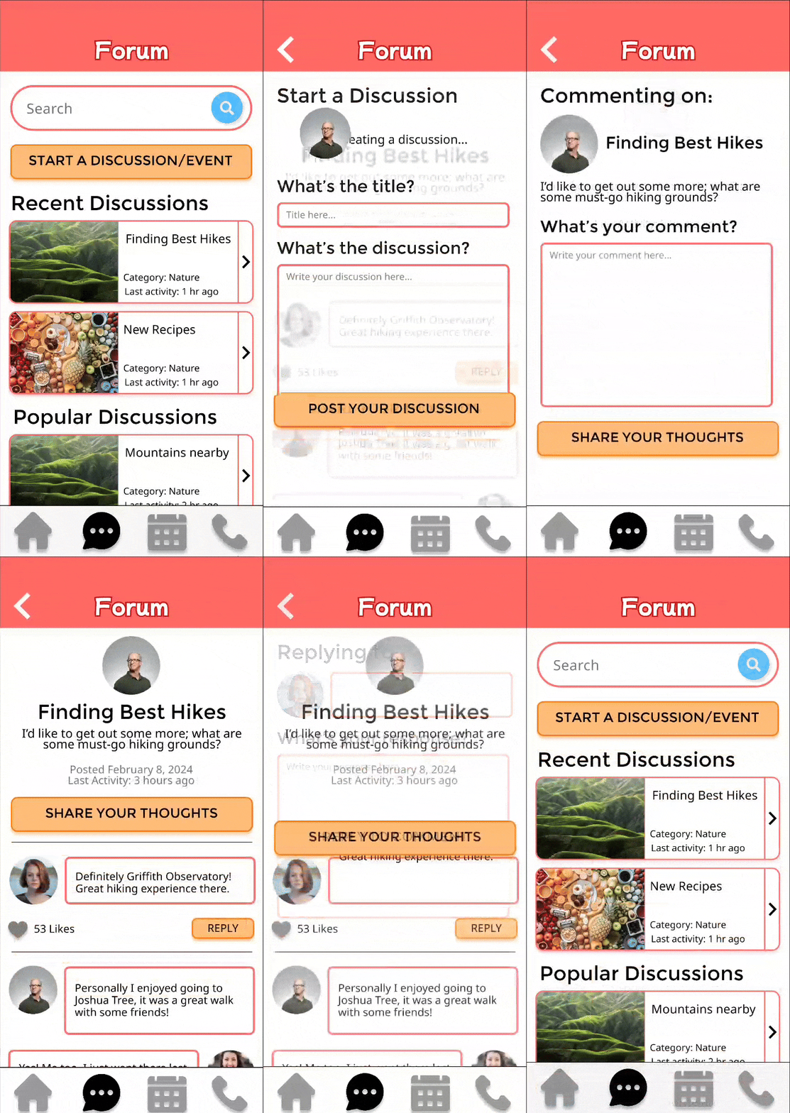
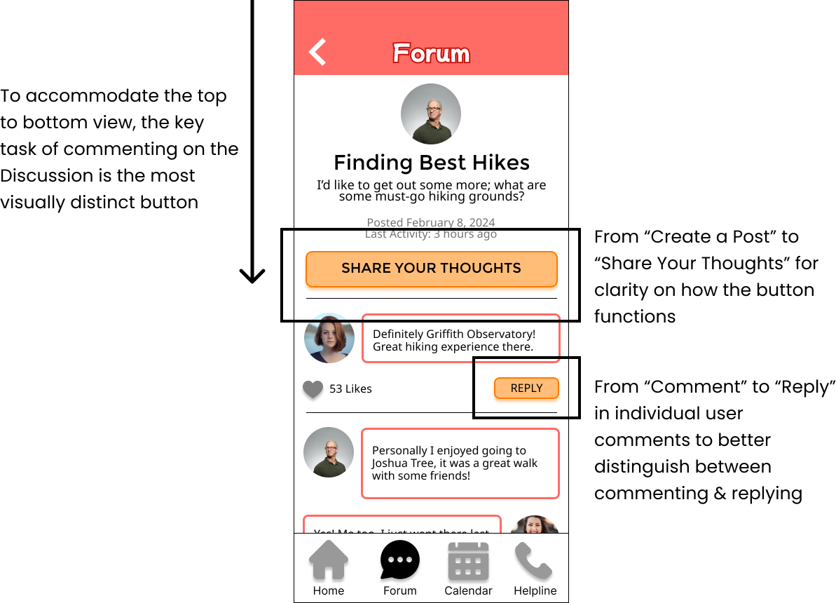
Participants found the visual layout of the Discussion Forum to be confusing as it was difficult to perform key tasks such as commenting and replying.
During this testing phase, usability issues were found in the Discussion Forum feature. We asked participants to perform key tasks related to the forum such as:
How would you share your thoughts in a discussion?
How would you respond to a specific comment?
Participants ran into trouble completing these tasks largely because of an apparent lack of visual clarity. The idea of “visual clarity” refers to the placement of content (buttons, other people’s comments). When asking participants to do tasks pertaining to the discussion, what we found was that our participants relied on a top-to-bottom viewpoint when looking at the page content. This would lead a snowball effect on creating following issues beyond simple issues such as what buttons do, or where to click.
Initial User Feedback
Contextual Need
One participant felt that the Onboarding felt “forced”, making it hard to understand the purpose of this personalization aspect.
With the mid-fidelity prototype that was presented to our participants, there was a lack of context. When approached with the Onboarding section in particular, we realized that users were tossed into a series of questions to “personalize” their experience, but the main issue: there is no apparent explanation for what Onboarding is for at any point throughout the section.
Onboarding Welcome Page Changes
Usability Testing Session: Results
After conducting our first usability testing session, we found that our users found issue primarily with visual clarity and contextual need.
Design Adjustments
I focused on improving the visual hierarchy of the Discussion page content according to our participants’ top-bottom view, distinguishing the key tasks of commenting and replying.
Homepage Navigation Vs. Bottom Navigation Bar
After discussion amongst the team, we decided to move forward with the Bottom Navigation Bar, prioritizing its consistent presence in any page throughout the app.
When we brought up the issue of the two different forms of navigation to participants, we presented both forms of navigation upfront, asking them to perform tasks making use of each one. What we found was that there was no clear winner for primary navigation, as there were pros and cons for both.
The Homepage Navigation was preferred for having all the key features of the app easily accessible from one location (homepage), just requiring users to click a back button to return to Home and select another feature. The linear format of the navigation made the flow from feature to feature simple. However, a disadvantage to the Homepage navigation was that users would have to click more often to navigate through the app. While being linear made navigation simpler, this also meant navigating backwards could be seen as tedious, compared to something like a bottom navigation bar.
The Bottom Navigation Bar, on the other hand, was preferred for being extremely quick-access from the bottom of the screen. By being a consistent component on every page, users are able to switch between the features of the app at any time. However, a drawback to this navigation is, as mentioned earlier, our research found that our participants tend to have a top to bottom view. A top to bottom view can lead to confusion on how to switch between features without immediately seeing the bottom navigation.
The main difference between the two navigations was: a simple, linear navigation versus a quick-access, consistently present navigation. The decision came to our team, as there was no clear choice.
Sunrise Connections Hi-Fi
Sunrise Connections Hi-Fi
Usability Testing: Follow-Up Feedback
To garner final feedback from our participants, I had an informal follow-up session with participants, showing our final hi-fidelity prototype.
In order to get a thorough opinion on the new iteration of designs, I had participants go through the various tasks for the app once again, asking them about any likes or dislikes and/or recommendations. After going through this follow-up, the general consensus was that everything was easy and straightforward.
With the final hi-fidelity prototype complete and tested, we were set at this point to move on to development of Sunrise Connections which would be passed on to my teammates.
A Brief On Development and Our Final Developed MVP
Passing Designs Onto Development
Once testing was completed, I passed on the final iteration of our designs to our development side of the team.
The development team was responsible for coding the designs given into a developed Minimum Viable Product to hand over to our sponsor, TCS, at the end of the project’s duration. As the team developed the designs, I was responsible for ensuring that our developers understood the various user flows of how Sunrise Connections should function and how the user interface of the MVP was developed. However, it is important to note that our team ran into challenges while developing the MVP, leading to necessary changes of the designs.
Challenges Met Turning Designs Into A Developed MVP
When attempting to develop an app from scratch, our team was required to learn some technical skills to properly code the MVP, making the process more difficult.
As our development team members developed the application, they found that they had to learn/strengthen new skills, such as:
Angular (at a proficient level)
Cloud Storage (Microsoft Azure)
Javascript
Typescript
Only 1 member of our development team had proficient experience in mobile application development, so making use of skills such as Angular, Javascript, and Typescript at a proficient level was something that required time and research to pick up. At the same time, however, this did lead to the need to simplify the final UI designs in the developed MVP. The hi-fidelity wireframes represent Sunrise Connection’s ideal UI, but for the sake of creating an initial MVP and meeting the project deadline, the simplification was necessary.
Cloud storage was the biggest challenge faced by our developers, as no one was familiar with how to operate with tools such as Microsoft Azure. Our team members had to spend weeks researching and figuring out how to host our application on Azure, as well as how to store user data on the hosted application.
Our final developed MVP was a simplified version of the hi-fidelity designs, implementing the key features we researched, designed, and tested.
Final Reflection
Final Hi-Fidelity Interactive Prototype
As a UX/UI Researcher & Designer for this project, I designed the final hi-fidelity interactive prototype.
Click the phone to check out the final design!
My Greatest Challenge: Keeping Users Involved
Starting this project from scratch, the biggest challenge, from my perspective, was definitely keeping users involved in the design process.
As the primary UX Researcher for the team, I was responsible for gathering the participants, particularly in user interviews and user testing. Recruiting via online methods, I was able to get 3-5 consistent participants willing to interview and test our application, but the main challenge was keeping their interest and trust. The project was spread throughout a nearly 6 month timeline, and I had to keep in contact with our participants for maybe 4 of those months. However, I came to learn that such long term interest will slowly wane.
Initially, I was able to interview all of our recruited participants, as that was the first actual session. However, as time went on, and it came time for the usability testing session, I had participants either stop responding to messages or lose interest. As a result, while I was still able to test our app with at least 3 participants, reducing the amount of user feedback greatly affected our possible addressing of usability issues.
Personally, the biggest setback that led to this major challenge in UX research was the fact that we recruited and performed all of our sessions online, with a lack of any in-person interactions. Being online, it presented issues on both ends: as an interviewee, I had to ensure that the elders understood how to make use of meeting apps such as Zoom, and adjust the testing session to be easy to follow. For the elder, on the other hand, there was a large suspicion of scams and false advertisements, so I do believe there is, due to the possibility of anonymity, always some sense of reservation to be completely comfortable interacting with our team. If possible, it would have been much better if we were able to perform UX Research in-person and get to know elders on a closer level for the ideal solution.
Reflection
Having handed off our MVP to our sponsor, I believe Sunrise Connections could take future steps to better address elder loneliness.
Looking at the final product of Sunrise Connections, I find that if we were to continue designing and developing the next iteration of the app, we could work on further user testing and participatory design so as to keep users involved in our design process. In order to better analyze the benefits of using an app such as ours, Sunrise Connections would benefit highly from, as mentioned earlier, in-person interviews and testing with our actual end-users.
Beyond further user testing, I feel like an app cannot be a definite “solution” to an issue as large as elder loneliness. For our app, I personally want it to be something that elders can use to instead alleviate the issue. By alleviating the issue, elders would hopefully socialize in a way that leads them to a healthier lifestyle away from loneliness. I understand that elder loneliness, and loneliness in general, is a large problem to tackle, but having the opportunity to work on a product that addresses the issue was truly an eye opening experience.
Sunrise Connections was an opportunity that allowed me to, for the first time, work directly with a sponsor. This introduced new constraints such as stakeholder requirements and expectations, but at the same time, exposed me to unbiased criticism to the UX Research and Design deliverables that I created.
Reference List
Centers for Disease Control and Prevention. (2021, April 29). Loneliness and Social Isolation Linked to Serious Health Conditions. CDC Alzheimer’s and Healthy Aging. https://www.cdc.gov/aging/publications/features/lonely-older-adults.html#:~:text=1-,Social%20isolation%20was%20associated%20with,50%25%20increased%20risk%20of%20dementia.&text=Poor%20social%20relationships%20.
National Institute on Aging. (2019, April 23). Social isolation, loneliness in older people pose health risks. NIH. https://www.nia.nih.gov/news/social-isolation-loneliness-older-people-pose-health-risks.


